Global Warming Close to Home

Climate. Just like weather: everyone is talking about it. But unlike weather, civilizations have been doing something about it – none to the good – ever since the industrial revolution. Since 1850, world-wide annual emissions of greenhouse gases have increased over 12-fold, trapping additional heat, and steadily warming the planet.
Weather is a huge problem if you are trying to combat climate change. Changes in weather are large, dramatic, rapid, and locally defined. You know when the remnants of hurricane Debby dump 5 inches of rain on you, pushing rivers over flood stage. That weather awareness has probably been front-of-brain ever since our ancestor "Lucy" walked the earth.
Global warming, on the other hand, is none of those things. This makes it easy to ignore, and easy for those with powerful economic and political incentives to deflect and dismiss it as a hoax. And they may well get away with it until the tipping point.
Here, I want to explore global warming in my backyard, and by extension your backyard, to explore how close we are to finding the calling card of the Apocalypse in our personal inboxes.
Introduction
It has been oppressively hot recently. No matter where you live, it has been hot. According to records at the Copernicus Climate Change Service:
On 22 July 2024, the daily global average temperature reached a new record high in the ERA5 dataset, at 17.16°C. This exceeds the previous records of 17.09°C, set just one day before on 21 July 2024.
For those in Fahrenheit land, 17.16°C is equal to 62.89°F. That was the daily average temperature worldwide; night, day, tropics, polar regions, all of it. The global average gathered over 24 hours. This set a new high for global mean temperature, besting records going back to 1940, and likely back to 1850.
Here in central Virginia, July 2024 brought a stretch of days, from the 4th to the 17th, in which the heat index exceeded 100°F for 8 straight days, and 13 out of 14 days in a row. It sure felt like something different. “Unprecedented”, as the political scribes say. Proof of global warming?
Brian wrote that obviously we are all frogs in a pot slowly heading for the boil.
Not in my backyard?
Like many of us for whom the “ozone hole” was an environmental wake-up call, I have never had difficulty accepting that human activity can, and does, impact the world’s climate and environment. It is not hyperbole to see global warming as a threat to human existence.
But I confess to have been thinking about global warming in only the roundest of terms. By that I mean, as global mean annual temperatures, and that frame of reference dominated my perception of the threat. For example, the Paris Accord, in 2016, sought to initiate actions that would limit global warming to 1.5°C or less. This year our current “temperature anomaly” is estimated to be +1.17°C over the climate of the 1970s. That rate of increase is very bad, of course, but it seems too small (approximately 0.023°C per year) to be able to notice within a year-to-year attention span. It seems a danger of the far future not the near present.
Climate change would hit a lot closer to home if it could be found in data from my own backyard. So let’s start with that streak of heatstroke days.
An exceptional hot streak?
My home weather station[1] has been patiently recording air temperature, humidity, and wind data since late December 2013, providing observations every 2.25 seconds for the past 10 years. That’s not long within the domain of weather records, but maybe it is long enough to check on my conviction that our recent 8-day heat index marathon was something pretty unusual.
First, I crunched through the database records[2] and pulled out the heat index high for every day since December 26, 2013. Then I scanned that data and computed all the instances where consecutive days skewered us with a heat index exceeding 100°F. Here is a time series plot of the instances where the hot streak lasted more than 3 days:
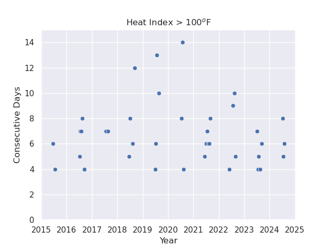
Welcome to “recency bias!” The cognitive phenomenon by which Donald J. Trump is perceived to be innocuous because he didn’t incite an insurrection yesterday.
I was certainly incorrect in thinking that our recent spate of 8 consecutive days with the heat index over 100°F was something exceptional. You might forgive the mental disappearing act of 14 days of excessive heat in 2020; I was probably indoors, hermetically sealed up against Covid-19. But, clearly, 8 consecutive days is nothing exceptional over the past decade. How could I be so misled? Well, recent research suggests that my prior belief in climate change reinforced that recency bias.
Local global warming?
If excessive heat spells are not part of a trend over the past decade, is a warming trend detectable at all? Chastened by my recent recency bias, I predicted that the answer would be no, large variations in my local temperature readings should dwarf any trend within the range of +0.3°F per decade. “Weather” should overwhelm “climate” on this timescale.
Yearly averages
I tried the simplest thing first: the mean yearly temperature over those 10 years. Here is a scatter plot of annual mean temperature by year at my weather station. The blue line marks the linear regression through the data points, and the shaded area demarcates the 95% confidence interval for the fit.
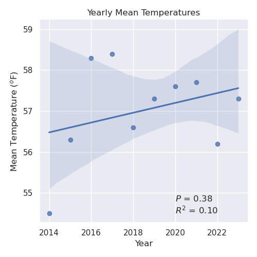
The best fit to that scatter plot is a line with positive slope, but don’t be fooled. The line is essentially meaningless. Those of you friendly with \(P\)-values and \(R^2\)-values will have already thrown that plot in the trash can. For those of you who are blessedly unfamiliar with statistical jargon,[3] just use your intuition: note that virtually any line drawn through that set of points, some up, some down, would look just as good (that is, bad) without the fancy-schmancy graphic flourishes.
I examined several other annual metrics, including the yearly mean high temperature, mean low temperature, heating degree days, cooling degree days, number of days with highs over 90°F, and number of days with lows below 32°F. None of those was any more robust.
So while there might be a gradual warming trend in the annual mean temperatures for my garden, I wouldn’t bet my bubblegum money on it using that data.
Monthly averages
What about seasonal trends? Computing an annual mean temperature distills a lot of averages down to a single number. What if a significant seasonal temperature trend was simply buried under data from the rest of the year. So I looked for a warming trend in mean monthly temperatures, maximum highs for the month, lows for the month, mean highs, mean lows, and heating and/or cooling degree days. To summarize a lot of crunching: I couldn’t find a significant trend in any month.
Except July! Here is a plot of mean monthly July temperatures by year.
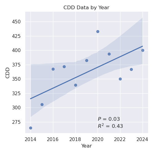
This is different! That \(P\)-value argues the slope of our regression line is statistically significant. If we conjured up 100 independent weather stations, all taking readings in my neighborhood over the past 10 years, our line would fit the data from 97 of them. Again, just by intuition, almost any reasonable straight line drawn through those points is going to have a positive slope. In this case, the slope of that best-fit line reflects a warming trend of +2.94°F per decade for the average July temperature.
I found this result rather shocking. A +3°F increase in the span of just 10 years is a dangerously rapid rate. That’s a rate an order of magnitude faster than the global average rates posted at the climate centers. At that rate, if I were born today, by the time I live to be my current age, the average July temperature would be 103°F. That’s not the high temperature, that’s the average temperature for the entire month.
Distrust but verify
That’s a pretty dramatic seasonal trend. I was skeptical, in large part because it is a significant trend in my data for only one month. True, July is where the heat is, but could it be an artifact of my humble weather station? Large variance in small data sets? How can we double-check the result?
The National Weather Service has an official weather station site near us at the Albemarle County Airport. Just a stone’s throw away. By accessing the NWS online database I was able to download the official July monthly average temperatures from 2000 to 2023. That was the default range on the website portal to the data. Here’s that plot:
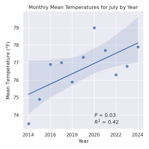
Whomp! There it is: a robust temperature increase in the average monthly temperature for July as recorded by professional meteorologists at the National Weather Service, from data collected almost right in my backyard. The slope of that regression reflects an increase in the average July temperature of 3.2°F per decade. My local weather station produced an estimate of 2.9°F. That agreement is so good it is embarrassing.
Furthermore, with this larger 23 year NWS data set, a warming trend could now also be detected in the yearly average temperatures, estimated at +2.2°F per decade (data not shown).
More data, please
Still, that isn’t called a scatter plot for nothing. There are lots of outliers lying out there, true to their name. More data would help.
It turns out that the NWS data from the Albemarle County Airport goes back much further than the year 2000. The first monthly average temperature recorded in the database is for January 1893. Here is a different analysis using a method called “Locally Weighted Linear Regression (LOWESS)” to process this much larger dataset. The best fit line through the data is shown in red. The region between the upper and lower bounds of the 95% confidence interval is shaded blue.
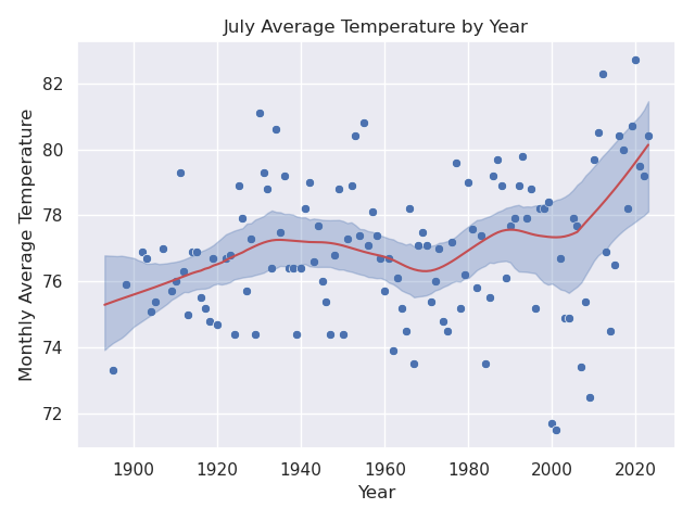
Again, there is an evident upward trend in temperatures since 2000 here in Charlottesville, In this analysis, the increase in average July temperatures is roughly +2.76°F since 2005 (1.5°F per decade) and +3.88°F since early 1970 (0.73°F per decade). If we stay within the 95% confidence interval from 1970 to 2023, the warming increase is anywhere from +1.6°F (0.3°F/decade) to +5.9°F (1.11°F/decade).
Global global warming
Well, that’s pretty fun stuff, but I agree it is perfectly reasonable to quibble with trends derived from my local data and, to a lesser extent, with the NWS data from its single weather station at the Albemarle airport. There is a lot of scatter in them thar plots.
So I do want to close by circling back to the big picture and drown in rising sea water any doubt about the global trend. NASA tracks global surface temperature in a database going back to about 1880. Here is a plot of that data:
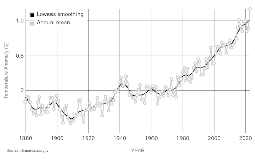
You can't doubt that trend. The average global temperature has increased about 1°C since 1975, or roughly 0.36°F per decade. There are many independent sources out there to corroborate these data.
Conclusions
- The noise of weather threatens to swamp the signal of climate change. No doubt about it. And I’m living proof that recency bias is real. So for those inclined to mistrust expertise, it is easy to dismiss global warming as a hoax when schools close because of snows in January.
- However, global warming is not under the radar. It’s in my backyard and yours. It can be detected in the records of a single NWS weather station in the mid-Atlantic, and perhaps even in just a decades worth of amateur backyard records. Tacking down the exact value of a specific local warming rate is difficult. For a Charlottesville July, we’ve discussed everything from 0.3°F to 3°F per decade. Most of that is due to large variance in small datasets. But it is very difficult to argue that the imprint of global warming is absent entirely.
- Highlighting the heterogeneity of climate warming, by season, month, and location, may be a more powerful way of convincing skeptics of the threat. While I was writing this piece, Harry Stevens, at the Climate Lab desk of The Washington Post, wrote a terrific article entitled, “Which season is warming faster in your town?”, with beautiful graphics and interactive widgets allowing the reader to check the data for their own city. Interestingly, although I found a larger increase in summer months than winter months using the NWS data, the ERA5 data from Copernicus, 1944 to 2023, that Stevens used indicates Charlottesville summers are warming by 0.39°F per decade, while our winters are warming faster, by 0.61°F per decade. I encourage you to go to his article and check your own location.
- I’m using a “Vantage Pro2” weather station made by Davis. It is positioned in a relatively open site up at the garden, but it is admittedly not sited well enough for professional meteorology. The data from the sensors is stored in a sqlite3 database and managed by the open source WeeWX weather software.
- The analyses here were done with scripts I wrote in the computer programming language Python 3. They are based on statistical software modules from scikit-learn and statsmodels, and are plotted using seaborn and matplotlib modules for data visualization.
- If you are curious, here is a brief attempt at a layman-style explanation of the statistical features. (1) The \(P\)-value describes the significance of the slope (“coefficient”) of the regression line. How much can we count on it. With \(P=0.38\) our plotted line will only work on 62 out of 100 cases. That’s approaching 50:50 coin-flip territory. If you are going to stick your neck out, you would prefer something like \(P ≤ 0.05\) in which your solution would be as good as, or better, than any other solution at least 95% of the time. Would you get on the plane if it only had a 62% chance of arriving at your destination? Didn’t think so. (2) The \(R^2\) result quantifies the extent to which the fitted line explains the distribution of the points. If \(R^2=1\), then all the points would be smack-dab on the line. If \(R^2=0\), then the points are just random spots from ketchup thrown against the wall of the White House dining room. The annual mean temperature plot above has \(R^2=0.10\) which means the regression line might account for 10% of the temperature distribution. Annual baseball attendance at Camden Yards would likely be just as informative.